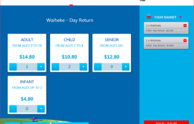
More than any other application, a kiosk stands or falls as a result of the interface design. While it’s important to have an attractive design which makes people want to walk up to the kiosk, the underlying architecture is equally important. Signage and location also play a large part as with any point of sale communications.
Kiosk interface designs normally do not work for websites, and vice versa. The differences are much deeper than just the size of the buttons. The 7 key differences between kiosk design and web design:
- Choosing to use the kiosk:
The user needs to see the kiosk, understand its purpose, and want to use it – from a distance and in busy locations. Attract loop, shroud and signage design are key, and locations need careful planning. - Wide range of users:
The user experience must cater to a wide range of people – including those who don’t normally use computers. Directions and cues should be obvious and not rely on standard online behaviour. - Completion of a specific task:
Most successful kiosks help the user to complete a specific task. The task and how to achieve it must be easily and quickly understood by someone who has not used the kiosk before.[blockquote indent=”yes” ]The user experience must cater to a wide range of people – including those who don’t normally use computers[/blockquote] - Distractions, noise, and crowds:
Even with careful planning the kiosk location may be crowded and full of distractions. The signage and interface should prepare the user at the start for any information they may need – credit or EFTPOS cards so they are not scrambling to find these half way through a transaction. - Speed of response is essential:
The user may be standing, carrying bags, or hanging onto toddlers. Speed and responsiveness is very important. - Privacy:
A balance needs to be struck between displaying the information to the user and displaying it to everyone else in the room. - Touching the screen:
Usually with their right hand. Some parts of the screen are more easily accessible than others, and while touching the screen, some areas will be blocked from view by the arm or hand. Buttons need to be large enough to be easily touched and far enough apart to avoid touching more than one button at once.(Courtesy of our partner Phosphor: http://www.phosphor.co.nz/kiosk-interface-design)

